If you want to create a comfortable user experience across any device, you should think of ways to improve your web design’s responsiveness. Here are a few tips and methodologies that you can apply.
1. Mobile-First Approach
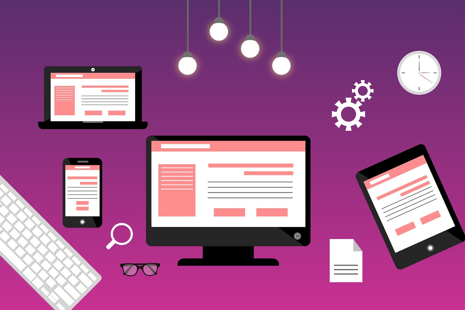
Image by Mudassar Iqbal from Pixabay
Since many Internet users these days are accessing the Internet through their phones, you should consider this when designing your website.
By prioritizing the mobile experience first, designers and developers ensure that their websites adapt to smaller screens, such as smartphones and tablets. This approach allows for a consistent and user-friendly browsing experience across all devices.
By embracing a mobile-first approach, designers can focus on essential elements such as simplicity, clarity, and intuitive navigation. They can prioritize content that is most relevant to users on the go, ensuring that it is easily accessible and legible on smaller screens. This design approach enhances the user experience and improves website performance by reducing unnecessary loading times or scrolling.
If your website is comfortable on a mobile phone, it is also great on a desktop.
2. Fluid Grids

Image by Visual Design from Unsplash
When planning the design for your website, consider using fluid grids in the design plan itself. The layout structure uses proportional measurements, such as percentages, rather than fixed pixel values. This grid guideline allows the elements within the grid to automatically adjust their size and position based on the available screen space.
Using fluid grids, designers can create flexible and adaptable layouts that respond effectively to various devices, from desktop computers to smartphones and tablets. Although the fluid grids aren’t something your users see, your designers will benefit from them the most.
It ensures consistency across different screen sizes, maintaining a unified visual experience for users regardless of their device. This flexibility also eliminates the need for separate designs or multiple website versions for different devices, saving time and effort for designers.
3. Flexible Images
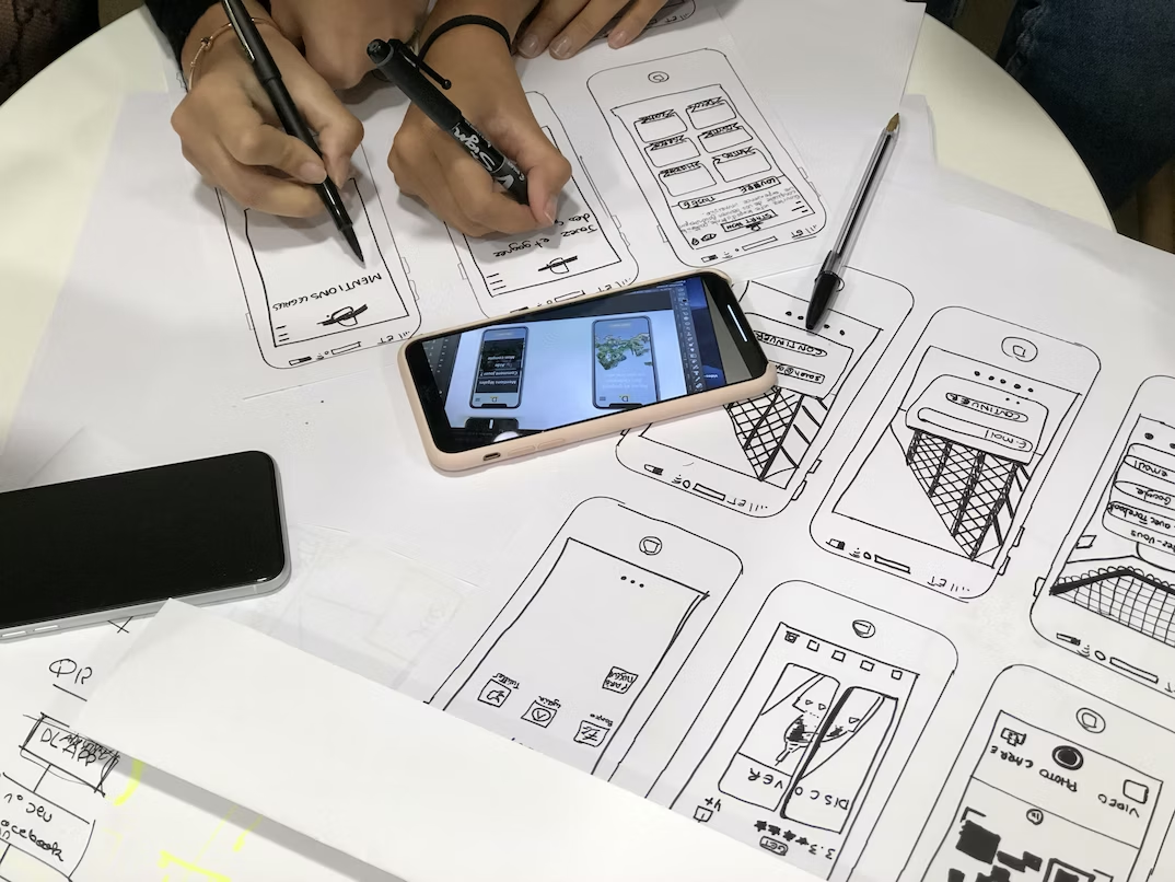
Image by Amélie Mourichon from Unsplash
One part of your website you want to ensure is responsive would be the images on it. Otherwise, the pictures you add can shatter the flow of your web pages and the text around them. That’s the reason why you would want to make sure that you have flexible images.
Flexible images refer to images that can dynamically adjust and adapt to different screen sizes and resolutions. They are an essential component of responsive web design, as they ensure that images displayed on a website look visually appealing and optimized across various devices, including desktops, tablets, and smartphones.
By using flexible images, web designers can ensure that their websites are aesthetically pleasing but also functional and user-friendly on any device. These images automatically scale up or down based on the available screen space without losing their quality or aspect ratio.
4. Media Queries
Anyone working on web development and design should know about media queries as these are your key to getting responsive web design.
It explicitly applies CSS to your website’s design only when it detects changes based on different things, like the devices they’re on or if your website user uses a mouse or a touchscreen.
It requires coding knowledge so that you can add these parameters before your website changes, so it needs more work. Nonetheless, it’s a great way to change your website.
5. Flexible Typography
Aside from the images needing flexibility, it would help to have flexible typography, especially the sizes. Otherwise, the content hierarchy and how your users read and experience your web pages can be complicated and confusing. In this case, just as there are flexible images, you should also work on flexible typography.
It allows the text to scale dynamically, ensuring optimal readability and visual appeal across various devices, from desktops to smartphones.
Since you most likely have a blog along with your website, you need to take care of the typography that you use. This typography ensures that users can access content without any hassle or compromise in readability, regardless of their device.
6. Touch-Friendly Design

Image by Rob Hampson from Unsplash
Many devices these days have touch capabilities, so you should keep in mind creating a touch-friendly design when designing your website.
This approach involves implementing features and elements that are easy to navigate, interact with, and provide a smooth browsing experience using gestures such as swiping, tapping, and pinching.
By adopting touch-friendly design principles, websites can adapt seamlessly to different screen sizes and resolutions. This ability for your website ensures that users can access and navigate the content effortlessly across various devices like smartphones or tablets without compromising visual appeal or functionality.
Consider which parts of your website a web user would want to touch, expecting a specific action to happen. You should pay special attention to these things when creating touch-friendly design options.
7. Performance Optimization
According to Sytian Productions, web developer philippines – performance optimization is a significant part of what you should work on when creating a responsive web design.
Visitors will leave your website as soon as possible if your website doesn’t load fast. Some websites forget to optimize their website’s loading speed on mobile phones simply because they checked their loading speed on the desktop, but the two are different.
Performance optimization involves various techniques, such as minimizing file sizes, optimizing code structure, leveraging caching mechanisms, and reducing server response time. These measures help reduce page load times significantly and improve overall website performance. Compare it differently between the phone and the desktop for this optimized performance.
8. Cross-Browser and Cross-Device Testing
Image by Denny Müller from Unsplash
When designing your website, make sure to test it on multiple devices. Don’t forget to change the browser you’re using as well.
Ideally, it should be a different device from the one you used to design your website so you can get a complete picture.
By taking the time to test these, you ensure that your work does work for your users.
9. Progressive Enhancement

Image by Kaleidico from Unsplash
Adopting the design methodology called progressive enhancement ensures that even those with less powerful devices or Internet access can access the critical content of your site. It’s about prioritizing the experience of those you assume don’t have an excellent device to see your website on rather than designing for powerful devices first.
If you guarantee a great user experience from the bottom up, it ensures an incredible user experience for anyone using your website.
10. Continuous Iteration
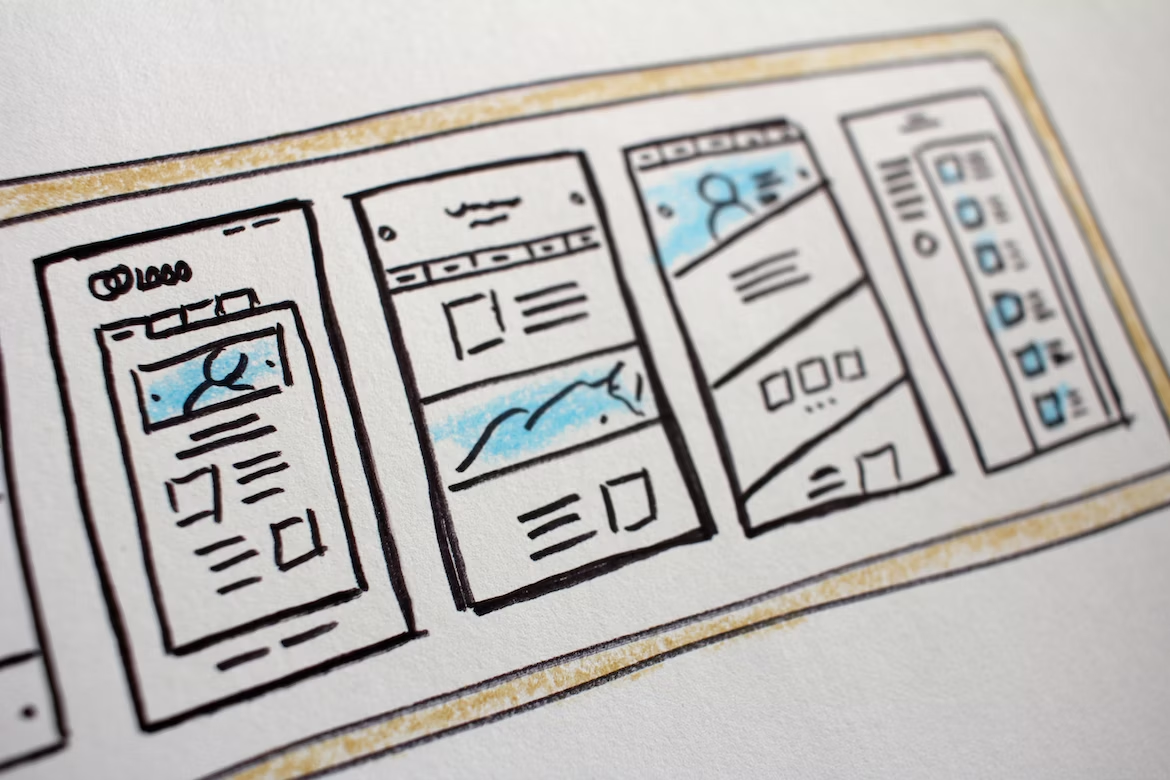
Image by Hal Gatewood from Unsplash
Just because you finally finish a concept of your web design that you’re happy with doesn’t mean it stops there. If you hear a typical web design issue or user feedback, change your web design as soon as possible.
This idea of continuous iteration ensures that you aren’t attached to the design you first made to the detriment of your user experience.
Conclusion
These design tips all help improve your user experience in one way. Whether adopting a more responsive web design principle or identifying necessary tweaks and aspects of your web design, these changes can make for a much better user experience on your website.


0 Comments